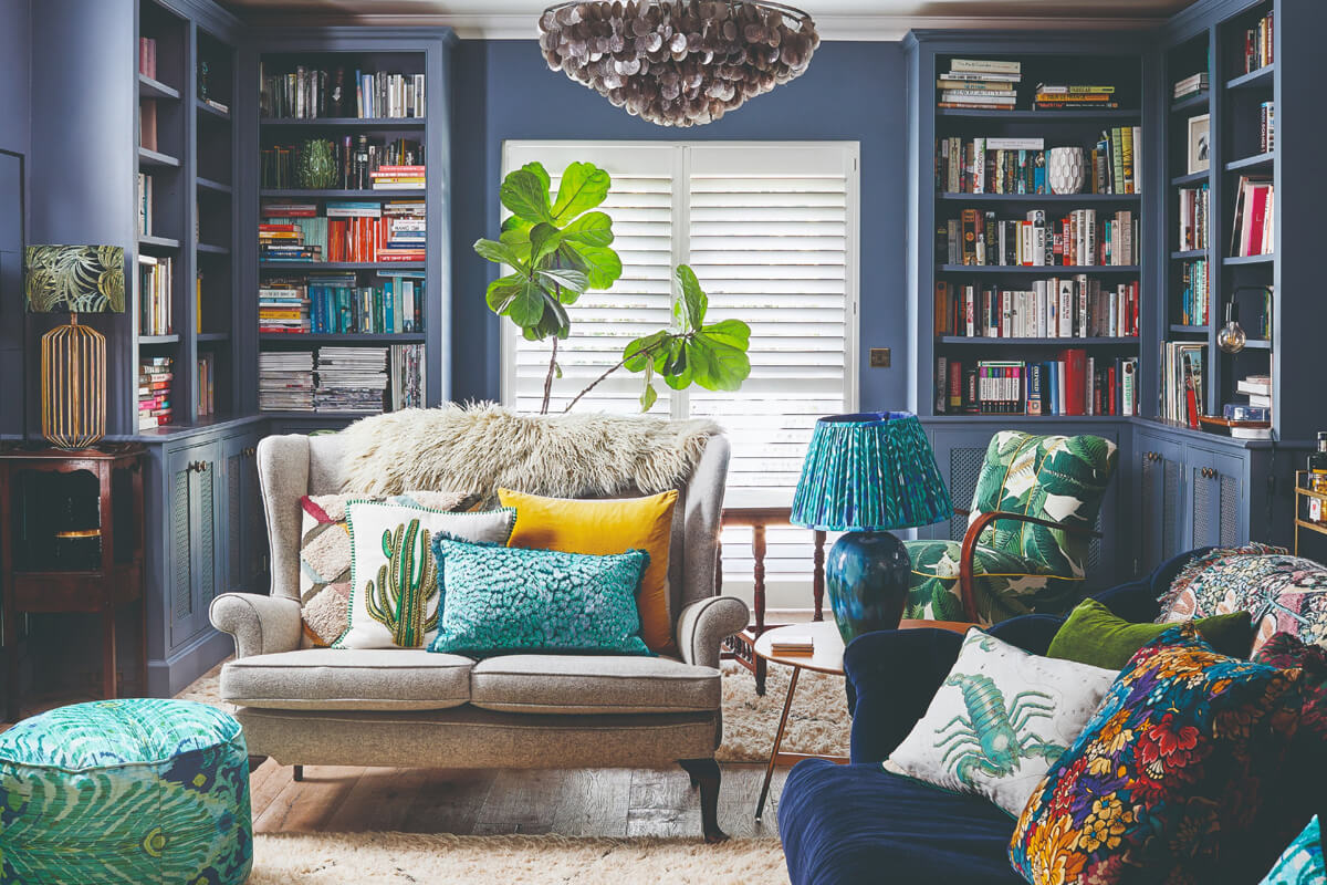
You can use different colour wallpaper to define your interior style by strategically selecting colors that reflect your personality and zoning different areas of your home. The right wallpaper colors create mood, establish focal points, and help separate functional spaces while maintaining visual flow throughout your home.
- How to Choose the Right Wallpaper Colors Using Color Harmony
- Using Wallpaper to Zone and Define Spaces
- Current Color Trends That Shape Interior Style Through Sophisticated Styling
- Full-Room vs Accent Wall: Making the Right Choice
- Trendy Wallpaper Styles for Bold Statements and Artisanal Appeal
- Psychology-Based Color Selection for Enhanced Well-being
- Common Mistakes and How to Avoid Them
- Practical Tips for Successful Implementation
How to Choose the Right Wallpaper Colors Using Color Harmony
Start with color harmony principles to pick wallpaper colors that work together. Look at the color wheel and choose analogous colors (next to each other) for calm spaces or complementary colors (opposite each other) for dramatic contrast.
Rich green will continue to be popular in 2025, with forest and olive greens taking centre stage. Jewel colours like emerald will also be widely used as accents for a bold, luxurious look. Understanding color psychology helps you make informed decisions beyond aesthetics. The psychology of colors, homeowners and designers can craft environments that enhance well-being, productivity, and overall harmony. Consider your room’s lighting when selecting colors. Natural light brings out true colors, while artificial lighting can shift how colors appear throughout the day.
Balance is key when working with bold colors. If you choose a vibrant wallpaper, pair it with neutral furniture and accessories to prevent overwhelming the space. Modern wall treatments benefit from this thoughtful approach to color coordination. Colors like Benjamin Moore’s Cinnamon Slate and brown tones like Pantone’s Mocha Mousse reflect a desire for warmth and comfort, while a soft sage like HGTV Home’s Quietude brings nature’s calming influence indoors. This approach allows you to experiment with trends while maintaining a timeless foundation that won’t quickly go out of style.
Using Wallpaper to Zone and Define Spaces
Wallpaper zoning creates distinct areas in open-plan homes without building walls. Choose different wallpaper colors for different zones – perhaps a warm earth tone for the dining area and a cooler shade for the living space within your broader interior scheme.
If it’s zoning a part of an open plan living space, then wallpapering just one wall is the perfect way to define and add a feature. However, current trends favor full-room wallpaper applications over traditional accent walls. Wallpaper wrapping all the walls within a room or space will be trending more than single accent walls. This approach creates more cohesive and intimate spaces within larger open areas.
Visual separation works beautifully with contrasting textures and patterns. Use textured wallpaper like grasscloth in your work area and smooth, patterned wallpaper in your relaxation zone. Use wallpaper to create a cozy dining space within an open-plan kitchen/living/dining layout. These decorative wall coverings signal to your brain that you’re entering different functional areas, helping you mentally transition between activities throughout your day.
Current Color Trends That Shape Interior Style Through Sophisticated Styling
Earthy tones dominate 2025 wallpaper trends, moving away from cool grays toward warmer, more grounding colors. “Complex muddier pink, purple, green, and yellow tones that have earthy, grounded bases,” ELLE DECOR A-List designer Ghislaine Viñas says is what she anticipates. This shift represents a departure from the stark plain walls that dominated previous decades.
Purple tones are emerging as the new neutral, offering sophistication without the starkness of gray. Trend forecasters have been purporting that purple is the interior color of the moment for some time now, and it seems we’re seeing that play out as predicted. These muddied colors feel more authentic and less artificial than their bright counterparts. Color psychology interior design is about creating an atmosphere that aligns with the purpose of a space while positively influencing emotions and behaviors.
Brown shades are experiencing a major comeback, evolving from their etymological roots (the word “color” derives from Latin color, meaning “tint” or “hue”). Brown has taken a sweeter turn from its dated appearance in 1970s interiors, and Mottershead predicts dessert-inspired hues, from chocolate and coffee to caramel and toffee, to reign in 2025. These warmer browns work beautifully as wallpaper colors, creating cozy spaces that feel sophisticated rather than dated.
Full-Room vs Accent Wall: Making the Right Choice
Full-room wallpaper creates more impact than single accent walls and helps establish stronger interior style definition. Most designers agree than a wallpaper accent wall can actually hurt the aesthetics and proportions of your space. This approach moves beyond the basic painted surfaces to create immersive environments.
When you use different colour wallpaper to define your interior style, consider the room’s function and size. Smaller rooms benefit from full-room treatment because it creates a cocoon-like feeling that makes the space feel intentional rather than cramped. Room design benefits from this holistic approach to wall finishes. The key is choosing colors that support the room’s purpose – calming blues and greens for bedrooms, energizing yellows for kitchens, or sophisticated jewel tones for formal dining areas.
Wallpaper box trends show that people crave immersive color experiences. “Deep, dark tones—like navy, emerald, and charcoal—are being used to create dramatic, intimate spaces with gold or brass accents for a sophisticated look,” says Elizabeth Rees, cofounder of Chasing Paper. This approach transforms rooms into distinctive spaces that reflect personal expression rather than following generic design rules.
Choosing Application Areas
Start with smaller spaces like powder rooms to test bold colors before committing to larger areas. The powder room is the perfect place to begin experimenting with wallpaper. Its small size means it won’t cost the earth, even with a very expensive design, and it won’t be the end of the world to redo if you hate the finished look. This approach allows you to understand how different color patterns work in your home’s unique lighting conditions.
Trendy Wallpaper Styles for Bold Statements and Artisanal Appeal
Nature-inspired patterns continue dominating 2025 trends, bringing the outdoors inside through botanical prints and organic textures. Rees also expects wallpaper tied to biophilic design will surge in popularity—especially “wallpapers featuring lush, oversized florals, tropical plants, and intricate botanicals.” These designs represent a polysemic approach to style – functioning both as interior decoration and wellness elements.
Textured wallpapers like grasscloth create depth without overwhelming patterns. “Grasscloth wallpaper isn’t going anywhere soon due to its natural texture and warm, inviting feel,” reveals designer Kate Marker of her eponymous firm, Kate Marker Interiors. These materials add sophisticated texture while maintaining neutral color palettes that work with various furniture styles. Textured wallpaper can make spaces feel more lived-in and cozy, which appeals to 60% of people who prefer inviting atmospheres.
Custom murals are gaining popularity for creating unique focal points. Emily Mould, the Romo Group’s Director of Design and Excellence, says, ‘2025 will bring a bolder approach to wallcoverings. Whether it’s a small-scale print or a striking graphic mural, 2025 will focus on infusing spaces with character and building interiors that seamlessly blend artistry with everyday living.’ These hand-painted elements help establish distinctive interior style that reflects your personality and interests through artisanal craftsmanship.
Psychology-Based Color Selection for Enhanced Well-being
Modern interior decoration increasingly considers psychological impacts of color choices. Warm Colors: Shades like red, orange, and yellow create a vibrant atmosphere. For instance, a living room adorned with bright orange wallpaper can encourage lively conversations and gatherings, strengthening connections among family and friends. Understanding these effects helps you create spaces that support specific activities and moods.
Cool Colors: Blue, green, and purple shades instill a sense of calm and comfort. For example, soft blue wallpaper in a bedroom can promote relaxation, helping you unwind after a long day. This scientific approach to home styling represents a sophisticated evolution from purely aesthetic decision-making. Blue relaxes the mind and slows down heart rate, metabolism, blood pressure, and hypertension.
Neutral colors provide foundational flexibility for changing decor styles. Using earthy tones, such as taupe or beige, provides flexibility and a soothing backdrop. These shades allow for experimentation with various decor styles. Interestingly, 70% of interior designers recommend neutral tones as excellent foundational colors due to their versatility.
Common Mistakes and How to Avoid Them
Don’t choose wallpaper colors in isolation from your room’s lighting and existing elements. Many people select wallpaper under store lighting without considering how it looks in their actual space, leading to disappointment during wallpaper installation.
Pattern mixing requires careful attention to scale and color coordination. “Make sure you pay attention to the color tones and [that] your prints aren’t too similar,” says designer Mimi Meacham. “Try mixing a floral with a geometric print or grasscloth texture.” Avoid using patterns that compete for attention – instead, choose one bold pattern and pair it with subtle textures or smaller-scale prints. Consider the room’s proportions when selecting pattern sizes to maintain proper visual balance.
Sampling mistakes cost time and money. Always order large samples and live with them for several days before making final decisions. Colors that look perfect in morning light might feel completely different in evening artificial light. This careful approach prevents the regret that comes from rushing into wallcovering decisions without proper consideration.
Practical Tips for Successful Implementation
Start your wallpaper journey with peel-and-stick options if you’re unsure about permanent choices. These removable wallcoverings allow you to experiment with bold colors and patterns without long-term commitment, making them perfect for renters or anyone who likes to update their style frequently.
Plan your color scheme by creating a mood board with wallpaper samples, paint chips, and fabric swatches. This visual approach helps you see how different elements work together before making purchases. Consider the 60-30-10 rule: use your wallpaper color as the dominant shade (60%), add a secondary color for furniture or larger accessories (30%), and include an accent color for smaller decorative items (10%) to achieve balanced interior decoration.
Professional installation ensures the best results for permanent wallpapers, especially with textured materials or intricate patterns. Measure carefully and order 10-15% extra wallpaper to account for pattern matching and potential mistakes. For zoning applications, plan your layout carefully to ensure pattern alignment between different areas creates visual flow rather than jarring transitions. This attention to detail elevates your home styling from amateur to professional quality.
Consider maintenance requirements when selecting wallpaper types. Kitchens and bathrooms need washable or vinyl wallpaper options, while living areas can accommodate more delicate materials. Q: What’s the best type of wallpaper for kitchens in open layouts? A: Vinyl or washable wallpapers work best for easy maintenance. Factor cleaning and durability into your decision-making process to ensure your wallpaper investment lasts for years.
By following these guidelines and staying informed about current trends, you can confidently use different colour wallpaper to define your interior style in ways that reflect your personality while creating functional, beautiful spaces that support your daily life and psychological well-being.
Key Points for Success:
- Color harmony principles guide successful wallpaper selection – use analogous colors for calm spaces or complementary colors for dramatic impact
- Zoning with wallpaper creates distinct functional areas in open-plan homes without building walls
- Current trends favor earthy, muddied tones and full-room applications over traditional accent walls
- Texture variety adds sophistication – combine grasscloth, silk, and patterned wallpapers thoughtfully
- Proper sampling and lighting consideration prevents costly mistakes and ensures satisfaction with your final choice


