
Cohesive home décor creates visual unity by connecting rooms through repeated elements like colors, finishes, and textures that work together as a harmonious family. You build this unified interior design through intentional choices that make your entire home feel purposeful and calming. The key is balancing consistency with personality, so every space flows together while still expressing your unique style and avoiding disjointed styling.
- Why a Whole-Home Color Palette Matters
- Use Gestalt Principles for Visual Harmony
- Layer Textures, Materials, and Accessories for Depth
- Apply Modern Techniques: Colour Capping and Panel Drenching
- Plan Flow: Consistent Finishes, Transition Spaces, and Layout
- Tools to Stay on Track: Mood Boards, Checklists, and the 60-30-10 Rule
Why a Whole-Home Color Palette Matters
Your cohesive color palette serves as the foundation that ties different rooms together and influences the emotional mood of your entire home . When you select three to five coordinating colors and use them throughout your space, you create automatic visual connections that support harmonious decorating.
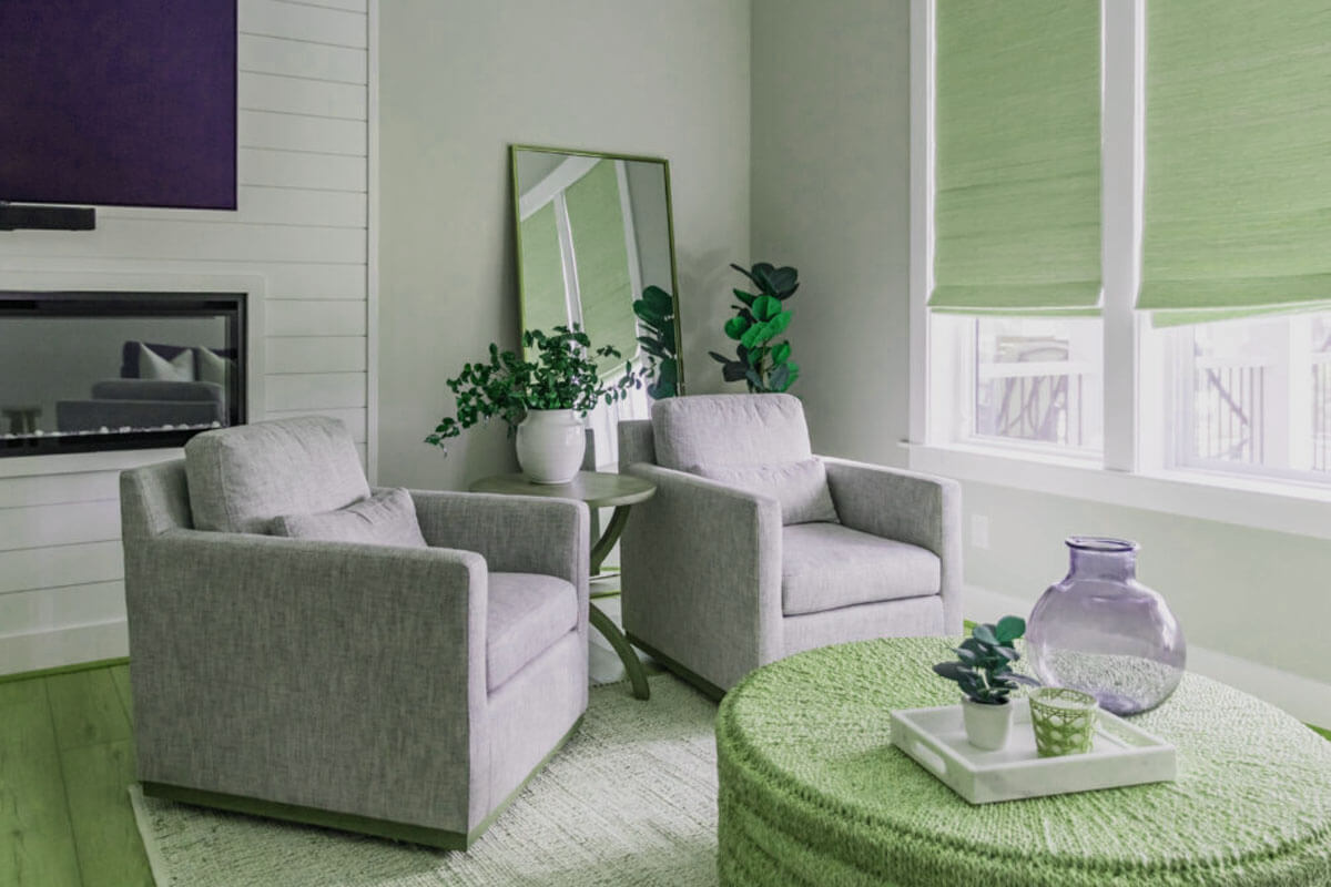
Rich, earthy tones like terracotta, deep browns, and sage greens are dominating 2025 color trends because they create warmth and connection to nature . These grounding colors work well as your primary palette, while jewel tones like emerald or sapphire blue make excellent accent choices. You don’t need to use every color in every room, but each space should include at least two colors from your chosen color scheme to maintain that crucial thread of continuity. This approach prevents the chaotic decorating that occurs when rooms feel disconnected.
Use Gestalt Principles for Visual Harmony
Gestalt principles are psychological design principles that explain how our brains naturally group visual elements together to create unified, harmonious spaces . These proven concepts help you arrange your décor in ways that feel naturally balanced and peaceful, supporting your overall interior design goals.
Similarity is your strongest tool for creating cohesion. When furniture, colors, and shapes share visual characteristics, our brains automatically see them as belonging together through style coordination . Repeat brass finishes across lighting and hardware, choose furniture with similar leg styles, or echo geometric patterns in different scales throughout your rooms.
Proximity groups elements that sit close together. Arrange your sofa, coffee table, and rug as a unified conversation area. Continuity guides the eye smoothly through space – align your furniture edges and create clear sight lines between rooms. These small choices add up to big impact in how connected your whole-house aesthetics feel.


Layer Textures, Materials, and Accessories for Depth
Textural layering with natural materials like linen, wool, wood, and stone creates visual interest while maintaining cohesion through similar organic qualities . Your texture palette should include rough and smooth, soft and hard, matte and glossy elements working together to create tactile harmony.
Start with larger textural elements like a chunky wool rug or linen curtains, then add smaller details through throw pillows, ceramics, and artwork. Natural materials like clay-based ceramics and woven textures are experiencing renewed popularity for their tactile appeal and ability to create sensorial design experiences . Wood tones should coordinate – choose warm or cool undertones and stick with them throughout your space.
Accessory cohesion comes from repeating materials rather than matching exactly. Your brass picture frames don’t need to match your brass lamp perfectly, but they should share similar warm or cool undertones. This creates interior consistency without feeling too coordinated or sterile.
Apply Modern Techniques: Colour Capping and Panel Drenching
Color drenching involves painting walls, ceiling, trim, and doors in the same color to create an immersive, cocoon-like effect that eliminates visual breaks and makes spaces feel more spacious . This bold technique works especially well in smaller, defined spaces like bedrooms, bathrooms, or reading nooks where you want to achieve living room cohesion or bedroom harmony.
Panel drenching is the latest evolution of this trend, using coordinated paneling installations across walls and key features to add texture while maintaining color consistency . Try board and batten or slat wall panels painted in your room’s main color for a sophisticated, layered look that supports your polished aesthetic.
Pattern drenching takes this concept further by using the same pattern or coordinating prints across multiple elements in a room. This energizing technique creates personality while maintaining visual cohesion through repetition . Start small with matching throw pillows and window treatments before adding larger pattern elements like wallpaper or rugs.
Plan Flow: Consistent Finishes, Transition Spaces, and Layout
Your home’s flowing design depends on how well you coordinate finishes and create smooth transitions between spaces . Choose hardware finishes (brass, black, chrome) and stick with them throughout your home. Your cabinet pulls, light fixtures, and plumbing fixtures should all share the same finish family to support sophisticated styling.
Transition spaces like hallways and entryways need special attention because they connect your rooms. Use flooring that coordinates with adjacent spaces, and carry at least one color from each connected room into these areas. A runner rug that picks up colors from both your living room and kitchen helps bridge the visual gap and maintains balanced proportions throughout your home decorating scheme.
Furniture layout affects flow as much as color choices.¹ Create clear walking paths and arrange furniture to encourage natural movement through your space. Position larger pieces like sofas and dining tables to define zones while maintaining open sight lines to connected areas. This approach supports your complete home design vision.
Tools to Stay on Track: Mood Boards, Checklists, and the 60-30-10 Rule
The 60-30-10 rule provides a foolproof framework for balanced color distribution: 60% dominant color, 30% secondary color, and 10% accent color . Your walls typically carry the 60% color, larger furniture and window treatments the 30%, and accessories like pillows and artwork the 10%. This time-tested approach, rooted in the Latin concept where “cohesive” comes from “cohaerere” meaning “to stick together,”² helps create unified décor.
Mood boards help you visualize how your choices work together before making purchases. Collect paint samples, fabric swatches, and inspiration photos on a large board or digital platform. Look for the visual threads that connect your selections – similar undertones, repeated textures, or coordinating patterns that support your home styling goals.
Create a design checklist for each room that includes your chosen color palette, required finishes, and must-have textures. This prevents impulse purchases that don’t fit your cohesive vision. When shopping, ask yourself: “How does this connect to what I already have?” and “Does this support my overall design story and harmonious interior?”
Your design timeline should start with the largest, most permanent elements (flooring, paint, built-ins) and work toward smaller accessories. This ensures your foundational choices support cohesion from the beginning, making it easier to layer in personality through décor.
Important Points for Cohesive Home Décor:
1. Repeat key elements – colors, finishes, and textures – across rooms for automatic visual connections
2. Use Gestalt psychology – similarity, proximity, and continuity – to arrange spaces that feel naturally balanced
3. Try modern techniques like color drenching or panel drenching to create dramatic, unified spaces
4. Apply the 60-30-10 rule for balanced color distribution and use mood boards to visualize connections
5. Plan your flow – coordinate finishes and create smooth transitions between spaces for seamless movement
The goal is creating homes that feel like sanctuaries – spaces where every element works together to support comfort, beauty, and personal expression through thoughtful interior coordination . When your décor choices connect and complement each other, your home becomes more than the sum of its parts, achieving that coveted harmonious decorating that makes every space feel intentionally designed.
¹ Flow in design context refers to visual movement between spaces, distinct from its more common meaning of water movement – an example of polysemy in design terminology.
² Etymology note: The term “cohesive” derives from the Latin “cohaerere,” meaning “to stick together,” which perfectly captures the essence of unified home design.